What is Utterances?
On the previous iteration of my blog, I defaulted to use the Disqus plugin readily available in the Hugo ecosystem. This time I wanted a less bloated alternative and stumbled upon Utterances, a lightweight and open source GitHub comments widget built on GitHub issues.
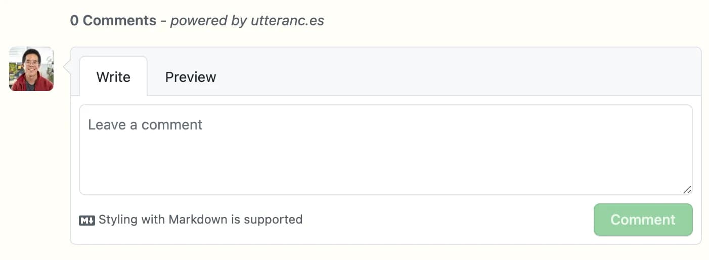
This interface will most likely feel familiar to you. You can even write your comments in GitHub flavored markdown.
Under the hood, the widget is linked to a public repository, which can be your blog’s own repository if it is public, or an independent one if you prefer to keep the rest of your code private or if you wish to keep your blog comments separate from your blog’s other issues. The utterances-bot creates an issue for each page where there are comments, and then appends each comment to this issue. As you might have guessed, any reader who wishes to post a comment has to sign-in to a GitHub account (which should not be too hard a constraint if your audience is mainly developers).
Integrate Utterances to your Gatsby blog
Follow the simple instructions on the official documentation. You can configure the title of the issues that the utterances-bot will create, and choose a theme that matches your blog (seven available as of the date of writing). Depending on your configuration, you should end up with a script…
<script
  src="https://utteranc.es/client.js"
  repo="[ENTER REPO HERE]"
  issue-term="pathname"
  theme="github-light"
  crossorigin="anonymous"
  async></script>
…which is unfortunately not copy-pastable as is, since React does not support the <script> tag. There are dark ways to go around this, but a more elegant solution would be to implement it the React way; let’s write a component!
This script is heavily inspired by Emma Goto’s excellent blog . Check it out for more Gatsby and React tips!
// src/components/comments.js

import React, { useEffect } from "react";

const COMMENTS_ID = "comments-container";

const Comments = () => {
  useEffect(() => {
    const script = document.createElement("script");
    script.src = "https://utteranc.es/client.js";
    // Replace with the repo on which you configured Utterances
    script.setAttribute("repo", "[ENTER REPO HERE]");
    script.setAttribute("issue-term", "pathname");
    script.setAttribute("theme", "github-light");
    script.setAttribute("crossorigin", "anonymous");
    script.async = true;

    const comments = document.getElementById(COMMENTS_ID);
    if (comments) comments.appendChild(script);

    return () => {
      const comments = document.getElementById(COMMENTS_ID);
      if (comments) comments.innerHTML = "";
    };
  }, []);

  return <div id={COMMENTS_ID} />;
};

export default Comments;
Dynamically change the theme
As the created widget is actually an iframe, we cannot change its CSS properties ourselves directly. Another way to make its theme match your blog’s is to add a toggle that will switch the theme according to the class of your body or html element, depending on how you implemented your dark theme toggle. For example, on this website, a “dark” class is added to the body element when you click on the sun/moon icon on the top right, which in turn triggers some color changes in my CSS file. Let’s add a little bit of code to our component (see highlighted lines):
// src/components/comments.js

import React, { useEffect } from "react";

const COMMENTS_ID = "comments-container";

const Comments = () => {
  useEffect(() => {
    const toggleDark = document.body.classList.contains("dark");

    const script = document.createElement("script");
    script.src = "https://utteranc.es/client.js";
    // Replace with the repo on which you configured Utterances
    script.setAttribute("repo", "[ENTER REPO HERE]");
    script.setAttribute("issue-term", "pathname");
    script.setAttribute("theme", toggleDark ? "icy-dark" : "github-light");
    script.setAttribute("crossorigin", "anonymous");
    script.async = true;

    const comments = document.getElementById(COMMENTS_ID);
    if (comments) comments.appendChild(script);

    return () => {
      const comments = document.getElementById(COMMENTS_ID);
      if (comments) comments.innerHTML = "";
    };
  }, []);

  return <div id={COMMENTS_ID} />;
};

export default Comments;
Now if you import and use the <Comments /> component in your blog post template (mine is at src/templates/blog-post.js, as yours should be if you’ve used the gatsby-starter-blog), it will indeed match the theme of the Utterances widget to your blog’s theme, but only on the blog posts’s initial loading. If you try to switch your theme while already on the blog post, it will not toggle a change in the comments widget. Let’s correct this!
Below is an extract from my layout template, which is the skeleton that is loaded on each page, mainly containing the navigation bar and the footer. The <DarkModeSwitch /> component is basically a glorified checkbox that keeps track of the currently selected theme. We will make use of the iframe.contentWindow.postMessage() method, which enables to send a “message” directly to the Utterances iframe content through cross-window communication.
// src/components/layout.js

<DarkModeSwitch
  checked={theme === "dark"}
  onChange={e => {
    toggleTheme(e ? "dark" : "light");
    const isComment = document.querySelector("iframe.utterances-frame");
    if (isComment) {
      const utterancesTheme = e ? "icy-dark" : "github-light";
      document
        .querySelector("iframe.utterances-frame")
        .contentWindow.postMessage(
          { type: "set-theme", theme: utterancesTheme },
          "https://utteranc.es/"
        );
    }
  }}
/>
When clicked, what the <DarkModeSwitch /> component does is
- It switches the theme class of our
bodyelement with thetoggleTheme()function (defined elsewhere) - If there is an Utterances iframe in the current page, it sends a “message” to its content to set its theme accordingly
And voilà, you now have a fully functional <Comments /> component that can bring a fully functional and themed comment system wherever you’d like!